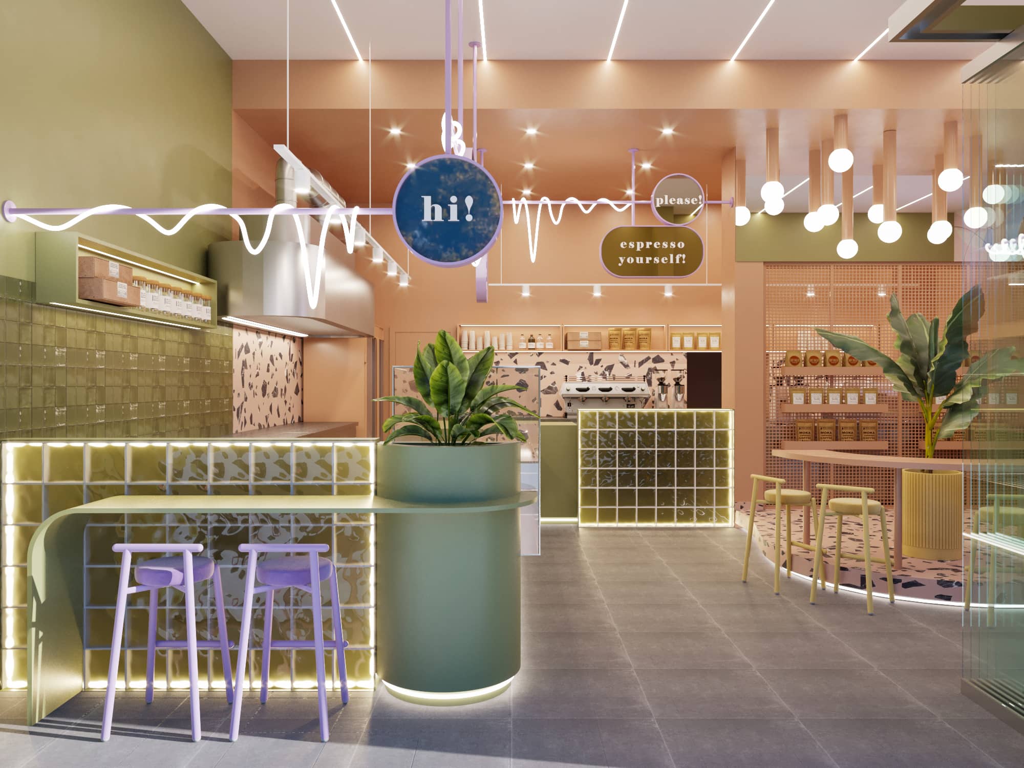
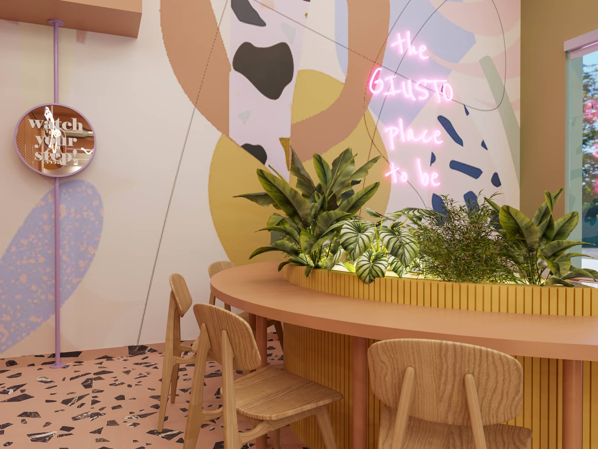
The store is located at the entrance of the city, which influenced a design approach with bold geometries and pastel tones, creating a space that captures the attention of passersby.
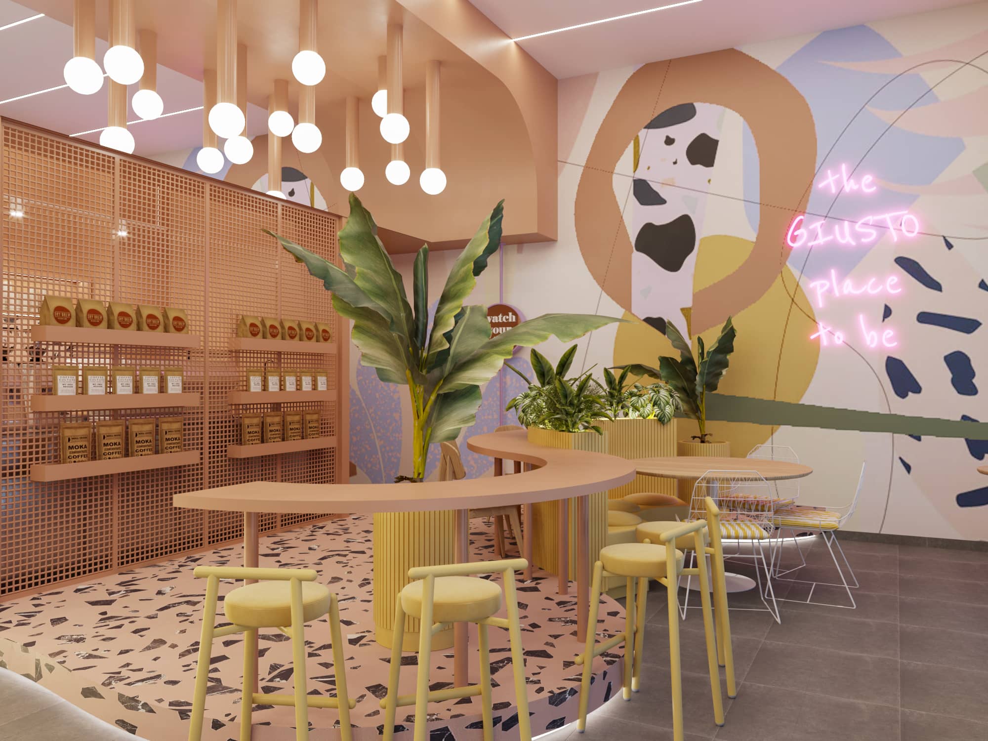
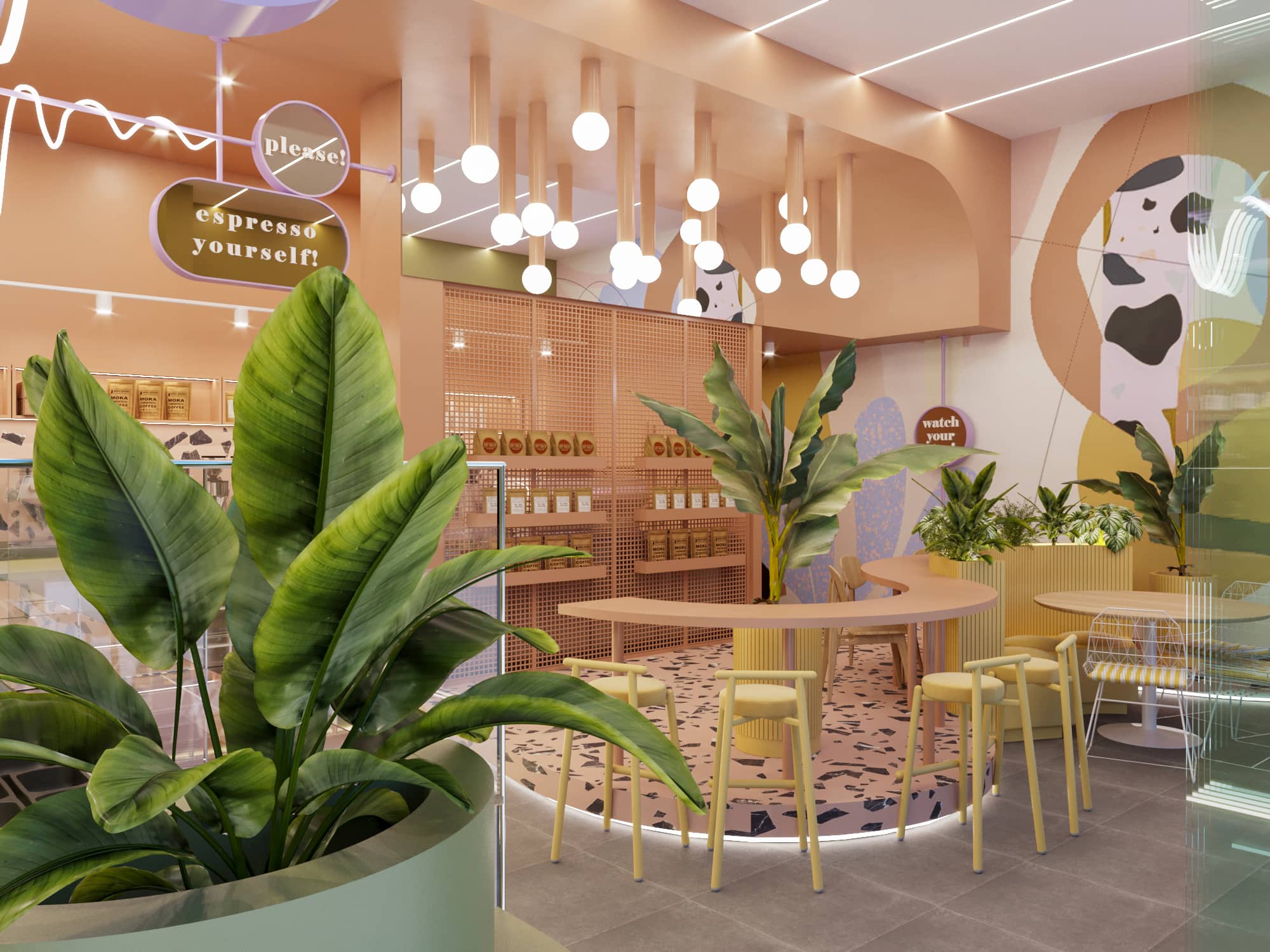
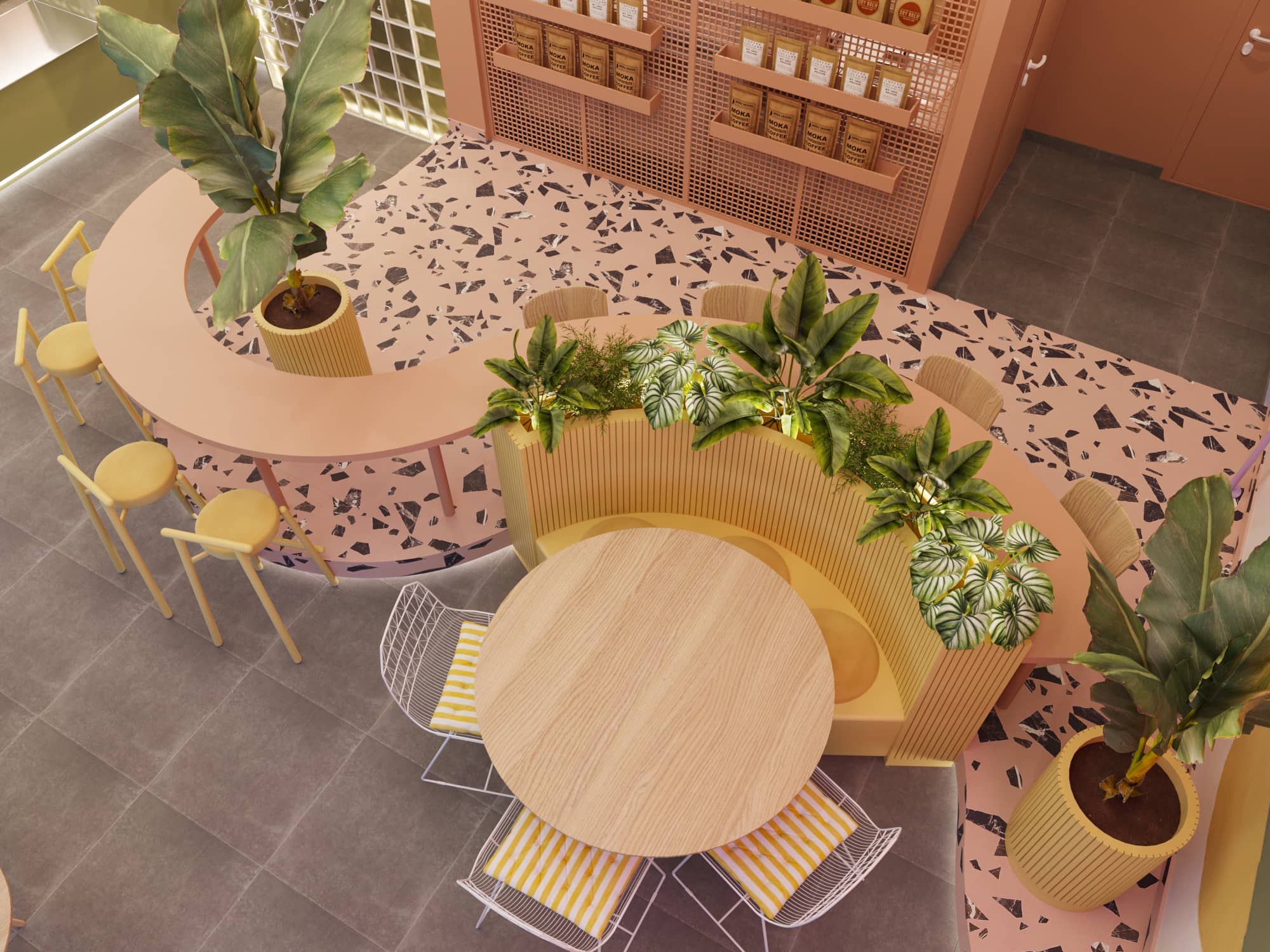
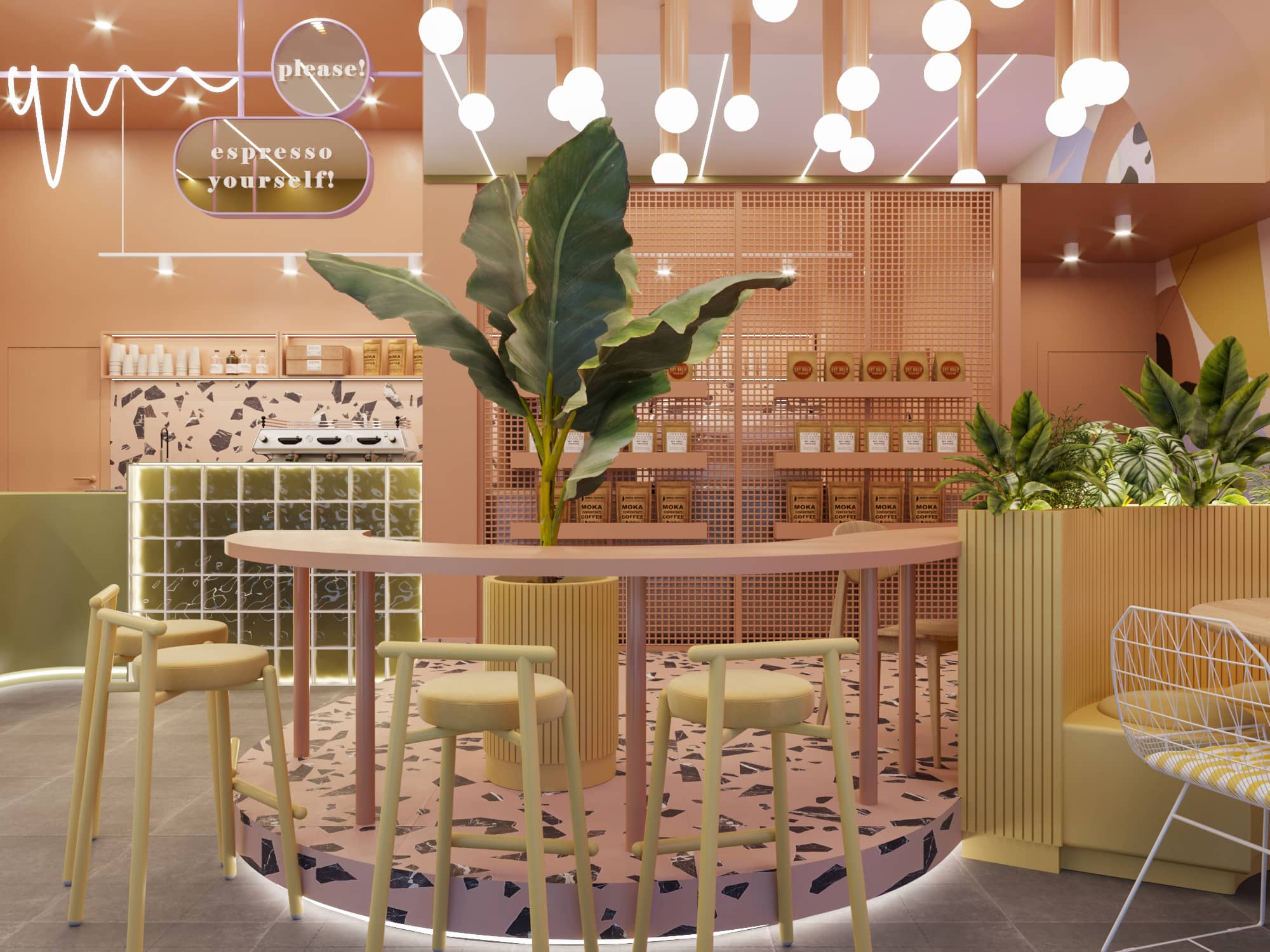
On one side, the seating area is elevated on a step, helping to organize visitor flow and differentiate it from the waiting area. The central space features a long, curved table, which seamlessly transitions into a planter and a built-in sofa, integrating the functions of the seating zone.
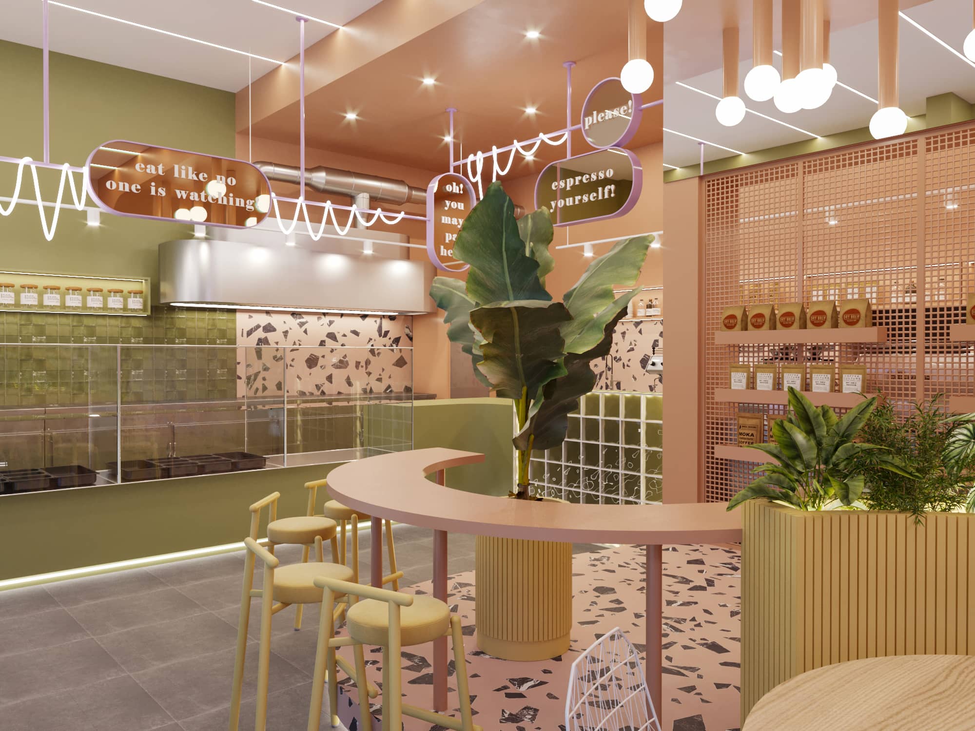
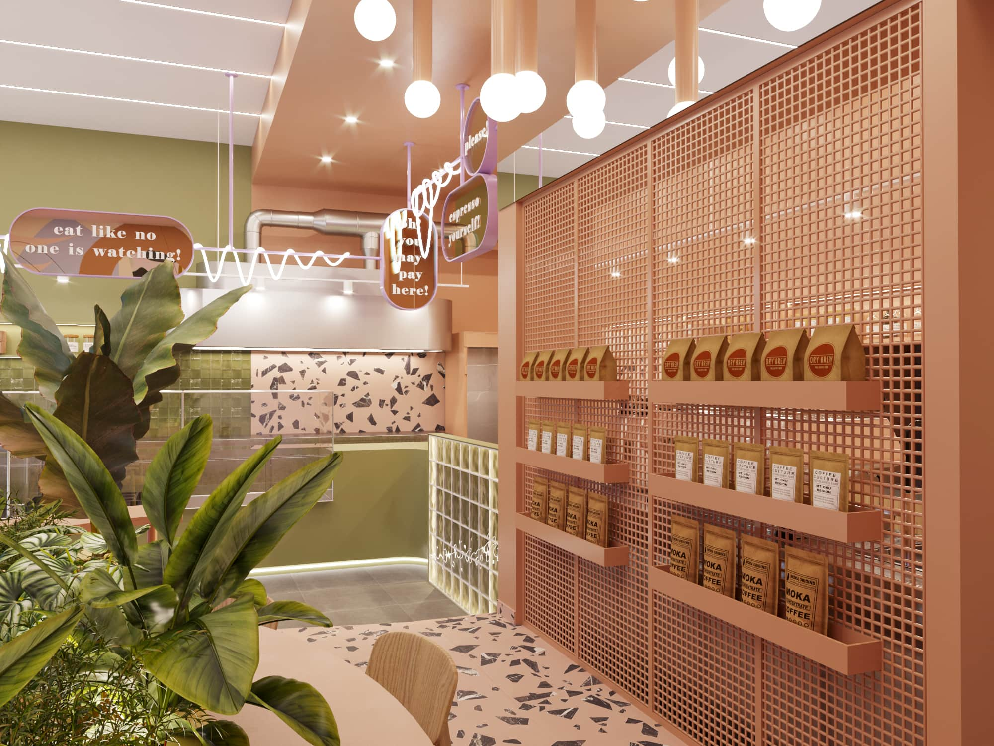
At the back, the preparation area is visually filtered through a perforated structure, which also houses the mini-market. The distinction between these two zones is emphasized by the unique ceiling, composed of curved elements and a suspended lighting cluster, enhancing the store’s atmosphere.
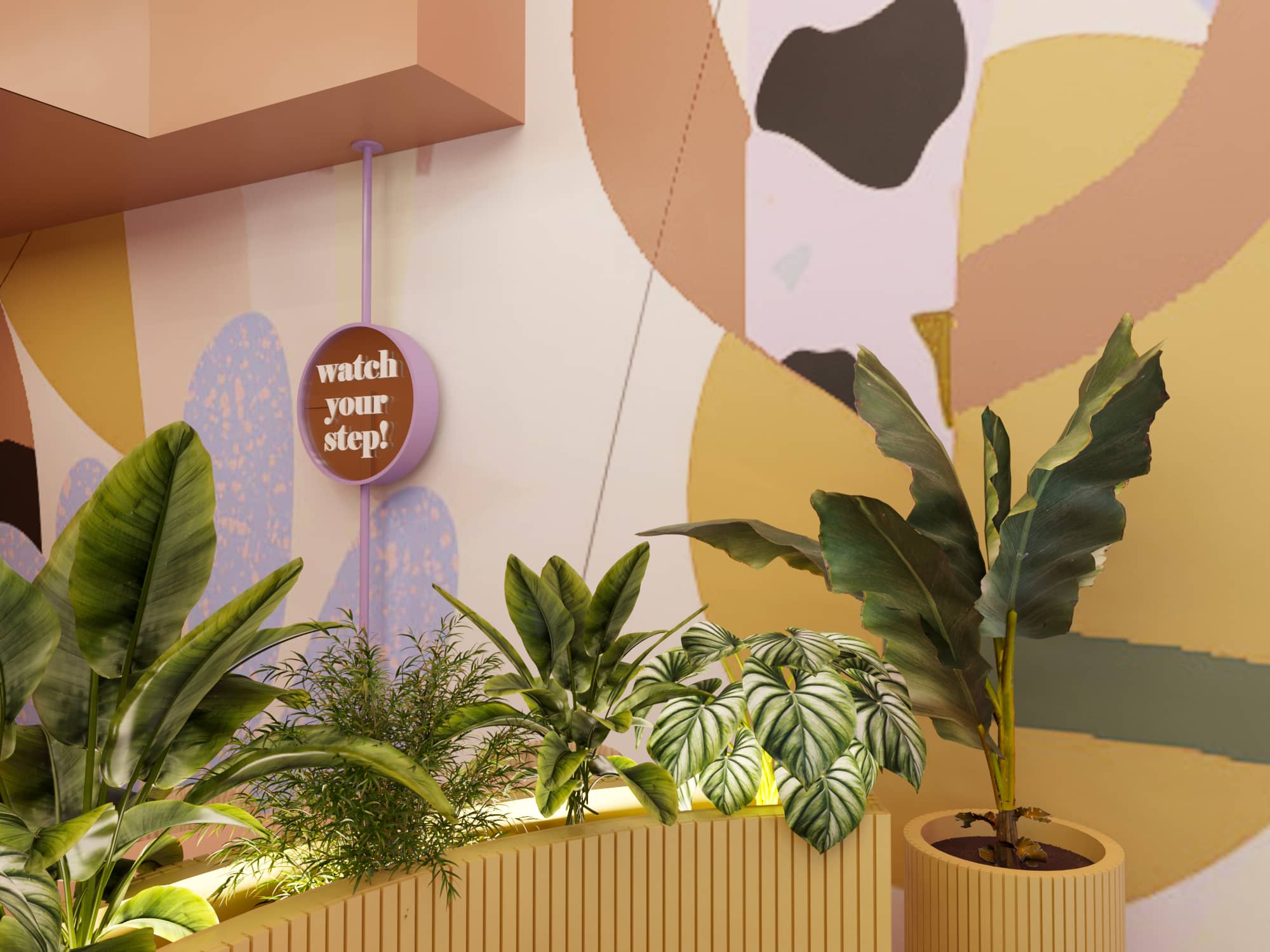
Throughout the space, custom graphic signage, exclusively designed by our team, serves both as wayfinding elements and as a playful branding feature. These consist of metal rings with a mirrored finish, featuring bold white typography that highlights the identity of the store.
A mural with the illuminated sign “The Giusto Place to Be” completes the funky aesthetic, incorporating a wordplay on the Italian meaning of the store’s name (Giusto = Right/Correct).
The variety of materials, patterns, and lighting choices shapes a distinct and recognizable space, delivering the intended spatial experience.
